Grace Wainaina sits down with Vernon Yai, a data protection and governance specialist who has spent years helping airport operations teams bring rigor, trust, and speed to geospatial digital twins. Vernon’s lens is pragmatic: integrate only what you can secure, prove, and sustain. In this conversation, he pulls back the curtain on how a modern Airport Integrated Operations Center consolidates nerve-fraying, fast-moving data into one living model—spanning a 22,000‑square‑foot operations floor, 600,000 base infrastructure features, and 18 million square feet of indoor space—so frontline teams can act confidently. Themes you’ll hear threaded throughout: co-location cutting handoffs; real-time geospatial layers that matter most; data validation amid conflicting FAA, airline, weather, and passenger signals; turning raw APIs into usable spatial objects; governance that keeps maps and dashboards trustworthy; and an emerging path to prediction and ROI that airport leaders can replicate.
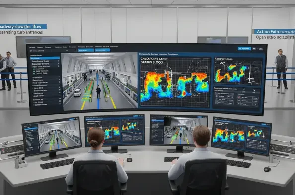
Your operations center unites 911, aviation security, airlines, and TSA in a 22,000‑square‑foot facility. How did you redesign workflows to cut handoffs, and what metrics prove it? Walk us through one incident where co-location changed the outcome, step by step.
We reworked the daily playbook around the digital twin instead of individual consoles. Co-location meant that 911, aviation security, airlines, and TSA now gather around the same geospatial view, anchored to those 600,000 base features—gates, taxiways, and roadways—so the first “handoff” is a shared map, not a forwarded email. In governance terms, we defined who owns each layer and who approves an operational change; in human terms, the 22,000‑square‑foot floor lets people swivel their chairs and solve together. What proved it were fewer back-and-forths to verify gate status and fewer escalations to supervisors; the twin’s single source view, paired with the same gate and aircraft movement dashboards, eliminated duplicate calls. One memorable incident started with a delayed arrival shown in red on the aircraft dashboard; a TSA lead, an airline ramp lead, and an ops duty manager converged at the same console, checked real-time aircraft position against the static gate layout, then used the same view to redirect a tug and adjust a checkpoint lane. No one waited for a callback—each step was visible on the common map, down to terminal congestion overlays and checkpoint status—and we saw the red avatar’s status normalize without triggering a cascading gate conflict.
A geospatial twin layers real-time data over 600,000 base infrastructure features. Which layers deliver the most operational value today, and why? Share a concrete scenario where combining static assets with live feeds prevented delays or reduced costs.
The most decisive combination is flight movement and gate availability layered on static gate geometry and taxiways. When you align live aircraft feeds with fixed assets—buildings, roadways, and stand positions—you immediately see conflicts before they become radio chatter. Add terminal congestion and checkpoint status on top, and the picture snaps into focus from curb to takeoff. A practical case: a departure’s live status shifted while an arrival was taxiing in; on the twin, the red-coded aircraft for the inbound intersected a planned pushback path on a static taxiway. Because the static gate location and the 18 million square feet of interior paths were in view, the ops team re-routed the pushback, sent a ground crew to an alternate corridor, and coordinated with TSA to relieve a swelling checkpoint right where those passengers would land, avoiding an unnecessary cascade at that gate line.
Tracking 18 million square feet of interior space is massive. How do you prioritize “high-touch” passenger areas, and what thresholds trigger interventions? Give an example with timestamps and staffing adjustments that improved throughput or customer satisfaction.
We prioritize “high-touch” by mapping footfall and feedback streams onto the floor plans—restrooms, concessions, and checkpoint lanes—across those 18 million square feet. We use checkpoint status and congestion overlays to establish operational thresholds—once certain zones trend into sustained congestion, the AIOC routes support to that exact spot. Feedback loops from customer experience tools also color how we act; a spike in negative sentiment tied to a named terminal corner, visible as a hotspot on the twin, prompts custodial or queueing changes. In one instance, a swelling checkpoint area appeared on the terminal congestion layer while aircraft delay statuses shifted on the gate dashboard; instead of scattering teams, we added lanes at that checkpoint and nudged concessions staff to open an adjacent service bay. The sensory cue wasn’t a spreadsheet—it was seeing red on the map where passengers actually stood, and hearing radios go quiet as flow evened out.
You pull data from airlines, FAA, weather, transportation analytics, and customer feedback tools. How do you validate conflicting feeds in real time, and who has final authority? Describe your escalation playbook with an anecdote and measurable impact.
We stack sources by authority for each decision type: for airspace and aircraft movement, FAA and airline data take precedence; for curbside and roadway, transportation analytics and our own sensors lead; for in-building sentiment, customer feedback tools guide staffing. The digital twin ingests data via our own APIs plus dozens of third‑party APIs—FlightAware for movement, National Weather Service for weather, FAA feeds, and more—and we bind each stream to a known spatial object. When two feeds conflict, our rule is to check provenance and freshness; whichever is authoritative for that domain and most recent wins, and a flag is raised on the layer for everyone to see. Final operational authority sits with the AIOC’s on-duty manager, who can convene 911, aviation security, TSA, and the airline rep at the shared screen. Recently, a storm cell on the weather layer didn’t match airline delay flags; we validated against the National Weather Service feed, leaned on FAA notices, and toggled aircraft avatars that turned red on the gate view. The on-duty manager authorized a gate shuffle in coordination with TSA to absorb passenger flow; because everyone worked off the same source and color coding, we acted once and avoided cascading rework.
Many feeds aren’t spatial by default. How do you transform raw API inputs into spatial objects at scale, and what standards or schemas keep it consistent? Share common failure modes and the checks you run before publishing to maps and dashboards.
We convert raw API data into shapes tied to the 600,000 base features—think linking flight identifiers to the exact gate polygon or mapping a sensor to a building footprint. Our schemas align each data type with a unique key that already exists in the twin—gates, runways, taxiways, and interior spaces across those 18 million square feet—so joins are deterministic, not guesswork. Failure modes usually show up as missing identifiers, temporal drift between feeds, or units and formats that don’t match; in a live airport, a tiny mismatch can paint a plane in the wrong spot. Before publishing, we validate joins against authoritative layers, verify timestamps, and run sanity checks that compare API positions to static constraints; if anything breaks those rules, the layer shows a warning and is quarantined from the main map until corrected.
Flight movement dashboards show color-coded delay statuses and gate availability. Which visual cues actually drive faster decisions, and which were misleading in practice? Tell a story of a design change that shaved minutes off a turnaround.
Simple, high‑contrast colors tied to operational states—like the red aircraft avatars for delayed or canceled—drove the fastest reactions because they matched radio language. Hover-to-detail worked well when the floor was calm, but in the heat of ops it slowed people down; we shifted essential fields into always‑visible callouts near the gate polygons. Initially, we overlaid too many icons on top of those 600,000 features, and the clutter hid what mattered. We reduced symbols, amped the contrast on gate availability, and aligned delay color codes with the way the FAA and airlines describe events. That change meant a ramp lead could glance at the gate view, see the red state, and immediately sequence crews without fishing for a tooltip; it felt like turning down the static on a radio and hearing only the key call sign.
Highway traffic, checkpoint status, and terminal congestion all inform passenger flow. How do you fuse these signals to forecast bottlenecks, and what lead times are realistic? Outline the steps you take from alert to action, including staffing or lane changes.
We anchor each signal to a place and pathway: roadway analytics to curb entrances, checkpoint status to security zones, and congestion to interior corridors. When the twin shows roadway slowdowns feeding into a specific terminal, and checkpoint status for that area trends tight, we raise a pre‑alert that links curb to queue in a single view. Realistic lead time varies by the domain feed, but tying it all into the geospatial model means we act as soon as the pattern coheres on the map. Steps are straightforward: the system triggers an alert on the terminal’s layer; the AIOC on-duty manager confers with TSA and airline station leads at the shared console; additional lanes open where the checkpoint overlay shows stress; concessions and custodial teams pivot to nearby high‑touch areas; and the gate view is monitored to prevent late‑arriving passengers from compounding the issue. The satisfaction lift we feel in the room comes when radios stop overlapping and the terminal heatmap cools from red to neutral.
Construction drawings often arrive in inconsistent formats. How do you enforce submission standards, and when do you resort to 3D laser scanning? Share a project where the scanning workflow saved rework, including cost and schedule deltas.
We publish a submission standard that mirrors how the twin stores base data—every drawing must reference the same coordinate system and tie to known features like buildings, taxiways, and gates. When drawings don’t meet those specs, or when the as‑built diverges quickly from the plan, we bring in 3D laser scanning to refresh the model; it’s become our backstop for change. Given the pace of airport updates, we’ve leaned on scanning to keep those 600,000 features aligned with reality, especially in areas that affect the 18 million square feet of interior space. On a terminal refresh, scan data snapped misaligned doorways and corridors back to their true positions, which meant passenger wayfinding and security routes drew correctly the first time. The human impact was palpable: teams stopped second‑guessing where walls “should” be, and operations didn’t have to unpick a map that would have sent people—and equipment—the wrong way.
Continuous data maintenance is hard in a constantly changing airport. What governance model, roles, and SLAs keep the twin accurate? Provide an example of a drift you caught, how you fixed it, and the downstream systems affected.
We run a federated model with clear data stewards for each layer and explicit SLAs for updates; think of it as a roster pinned to the wall of the 22,000‑square‑foot AIOC. For base infrastructure, a central GIS team curates the 600,000 features; for operations, the AIOC stewards live layers like flight movement, checkpoint status, and terminal congestion; for sentiment, customer experience teams own their feed. Drift shows up as exceptions—an aircraft avatar that looks wrong against a gate polygon or a corridor that doesn’t match scanning. We once caught a corridor misplacement after a minor construction shift; scanning corrected the geometry, and the fix propagated to dashboards used by finance and aviation security. That one correction meant finance saw accurate footfall for business cases, while security routes matched the actual interior paths, reducing confusion.
Different departments, like finance and security, use the same data but need distinct views. How do you tailor dashboards without creating version sprawl? Walk through your templating, permissions, and KPI alignment with a concrete case.
We use a single data store and separate templates per persona. The underlying layers—gates, runways, buildings, roadways, and terminal spaces—remain consistent, while views differ by filters and KPI panels. Finance sees utilization and demand indicators aligned to the same gate and terminal footprints; aviation security sees patrol routes, checkpoint status, and congestion overlays. Permissions bind templates to roles, so edits to the core schema update every view without copy‑pasting dashboards. In practice, finance and security used one shared gate availability layer but different panels—finance tracked utilization while security monitored real‑time movement and queue states; both looked at the same truth, just tuned to their mission.
When integrating legacy systems and proprietary tools, how do you balance custom connectors versus standard APIs? Share your decision framework, including cost, time-to-value, and resilience trade-offs, plus one integration you would approach differently now.
Our first question is longevity: if we can reach data via the twin’s own APIs or one of dozens of third‑party APIs already in use, that’s the default. Custom connectors are a last resort, especially when legacy tools can export into a format the twin understands. We weigh cost against time‑to‑value—standard APIs reduce both—and then test resilience by simulating feed dropouts to see which path recovers quicker. In one case, we bent to a proprietary format and built a one‑off bridge; it worked, but every schema change upstream meant a scramble. If we could rewind, we’d insist on a conversion path into the same schema we use for gates, runways, and interior spaces, so the connector could ride the platform’s existing guardrails.
You mentioned applying data to platforms like Tableau alongside maps. When is a chart better than a map for operations decisions, and vice versa? Offer a before-and-after example where changing the medium changed the action taken.
When you need to grasp where something is happening—what gate, what corridor, which taxiway—a map wins. When you need to compare trends, like queue times across multiple checkpoints or delay categories across airlines, a chart tells the story faster. We often present both off the same feeds: the aircraft movement and gate availability map for situational awareness; a charting view for patterns and exceptions. Before, a congestion issue hid inside someone’s mental model of the terminal; once we put the checkpoint status on the map alongside terminal congestion, you could see the bottleneck, while a chart showed the sustained impact across hours. The room went from debating anecdotes to acting off a shared picture and a trend line that backed it up.
You plan prediction, regression, and scenario modeling, with possible AI features. Which use cases top the list, and what ground truth will validate models? Describe your model lifecycle—from data prep to deployment to post-incident learning—with one illustrative metric.
We’re targeting predictive congestion at checkpoints, gate conflict avoidance, and scenario modeling for weather disruptions. Ground truth comes from the same authoritative feeds we already trust—FAA, airline movement, and observed checkpoint status—and from post‑event playback in the twin. The lifecycle is disciplined: we prepare data by aligning every feed to known spatial objects; we train models on historical incidents visible in the aircraft and gate dashboards; we deploy behind a feature flag so operators can compare model prompts to live layers; then we run post‑incident learning sessions to reconcile predictions with what actually unfolded on the map. A simple illustrative point is whether the model flags a potential gate conflict that would have turned a neutral aircraft icon to red; we validate success if the conflict never manifests on the live dashboard because the team intervened.
Proving ROI can be elusive. Which hard metrics (e.g., delay minutes, gate utilization, overtime, safety incidents) moved first, and how did you attribute causality? Share one win and one surprise where the outcome differed from expectations.
The earliest signals were operational clarity and fewer escalations—people acted faster because aircraft movement, gate availability, and terminal congestion lived in one place. Hard metrics like gate utilization and delay states became easier to track because the twin already displayed them, color‑coded, on the same dashboard. Attribution hinged on the governance we set—same layers, same SLAs, same source of truth—so when a red state averted on the map coincided with a coordinated gate change, we could reasonably connect the dots. A clear win was fewer duplicate calls between TSA, airlines, and aviation security after co‑location; the surprise was that simplifying the visual language—reducing icons and centering the map on essential features—had a bigger impact than introducing new widgets. It taught us that trustworthy data plus human‑centered design moves the needle more than bells and whistles.
For leaders starting a digital twin, how should they scope a pilot, select initial data sources, and avoid common pitfalls? Provide a 90-day plan with roles, milestones, and measurable success criteria.
Scope the pilot where pain is acute and data is accessible: start with aircraft movement, gate availability, and one terminal’s checkpoint status. Choose sources you can vet—your own APIs and a handful of third‑party APIs you already use—then anchor them to base features like gates, taxiways, buildings, and roadways. The 90‑day arc looks like this:
- Days 1–30: stand up the base map with the 600,000 features you need for your pilot area; define stewards and SLAs; connect two to three authoritative feeds; publish a simple aircraft and gate dashboard with color-coded states.
- Days 31–60: add terminal congestion and checkpoint status; template views for operations and security; run tabletop exercises in your AIOC space—even if it’s not 22,000 square feet—to rehearse decisions.
- Days 61–90: stabilize joins, quarantine flaky feeds, and refine visuals; introduce a basic scenario model behind a feature flag; document escalation and validation rules.Roles include a GIS lead, a data steward per layer, and an on‑duty ops owner. Success criterioperators use the twin in live decisions; duplicate calls between teams drop; and at least one avoided gate conflict or smoothed checkpoint surge is demonstrable on the dashboard playback.
What is your forecast for airport digital twins?
The near future is less about novelty and more about trust, scale, and foresight. Trust comes from rooting every real-time feed to known spatial objects and governing them with clear SLAs; scale means moving from one terminal to all 18 million square feet without losing fidelity; and foresight arrives when prediction and scenario tools sit alongside the same aircraft and gate views people already use. Expect broader use across departments—finance and aviation security already work from the same base layers—plus deeper integration with third‑party APIs that operators recognize at a glance. Most of all, the winners will keep the experience human: a clean, shared view that turns complex signals into clear action, so when an aircraft icon flips from red to neutral, everyone in the room can feel the airport breathe again.